
The Brief
To design an icon system for a student accommodation marketplace that infuses a friendly yet scalable user-centric approach.
To design an icon system for a student accommodation marketplace that infuses a friendly yet scalable user-centric approach.
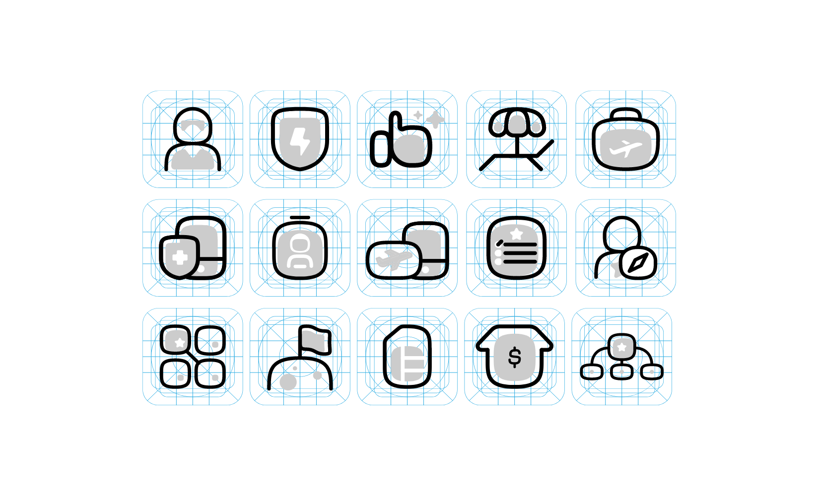
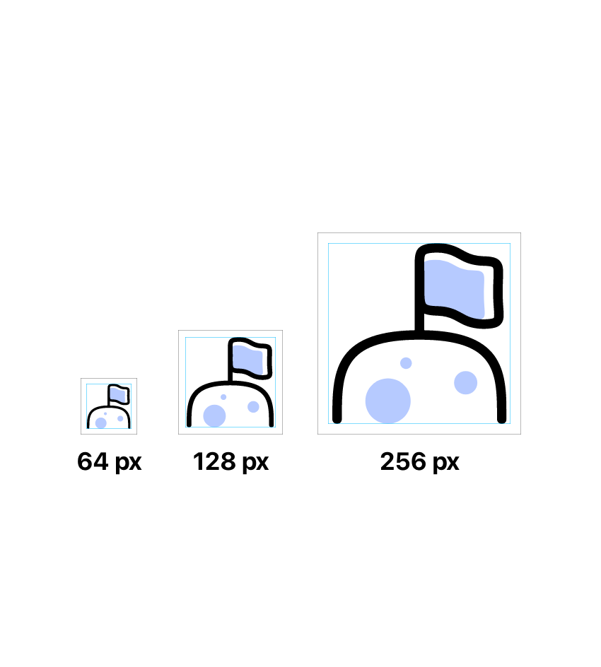
Approach
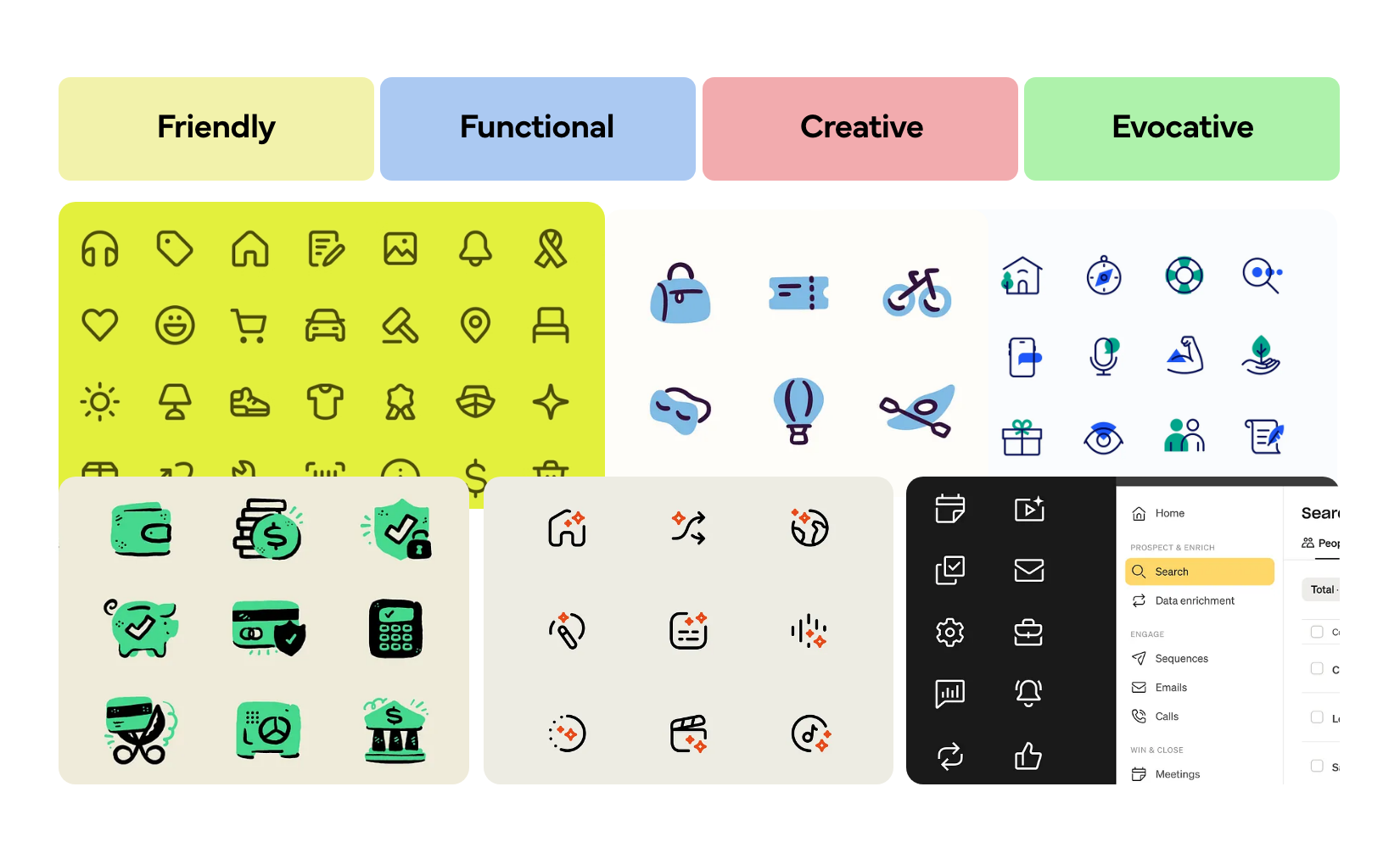
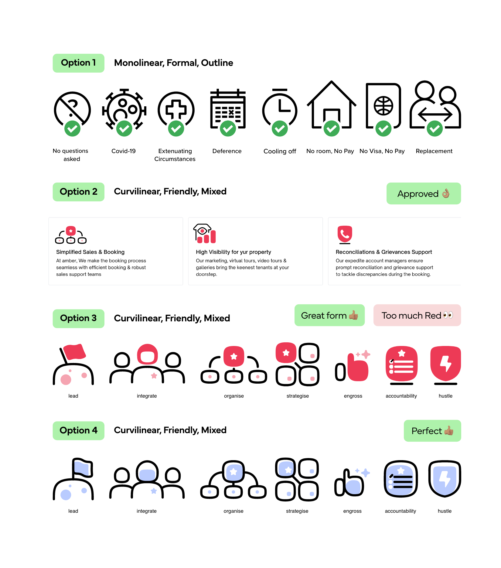
Characteristics


Want to read the full case study? Get in touch!