
Design Objective
This project aims to boost user adoption of Tesco's Whoosh delivery service and enhance the overall product experience for the slot booking process.
Current Scenario

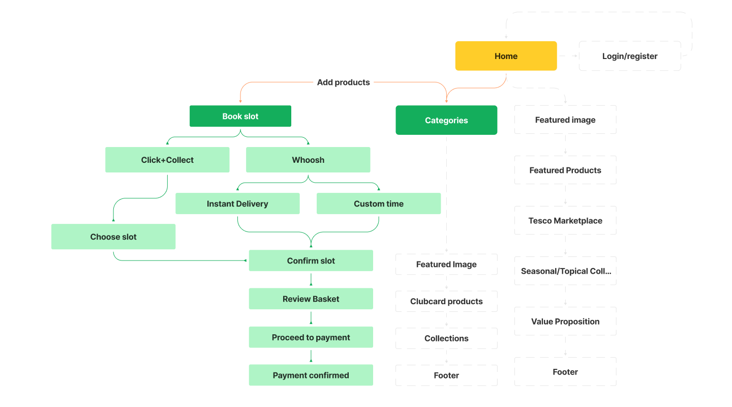
Current user flow
User journey

Flow Schema from inception to completion
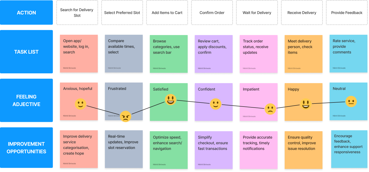
Empathy Mapping
Information Architecture
In the existing system, the overall shopping experience was divided into 3 parts, click+collect, Home delivery and Whoosh (instant delivery). Upon further research, it was evident that the delivery service can be merged into a single service, Whoosh. This will enable us to reduce the extra step between choosing the service and executing the payment.
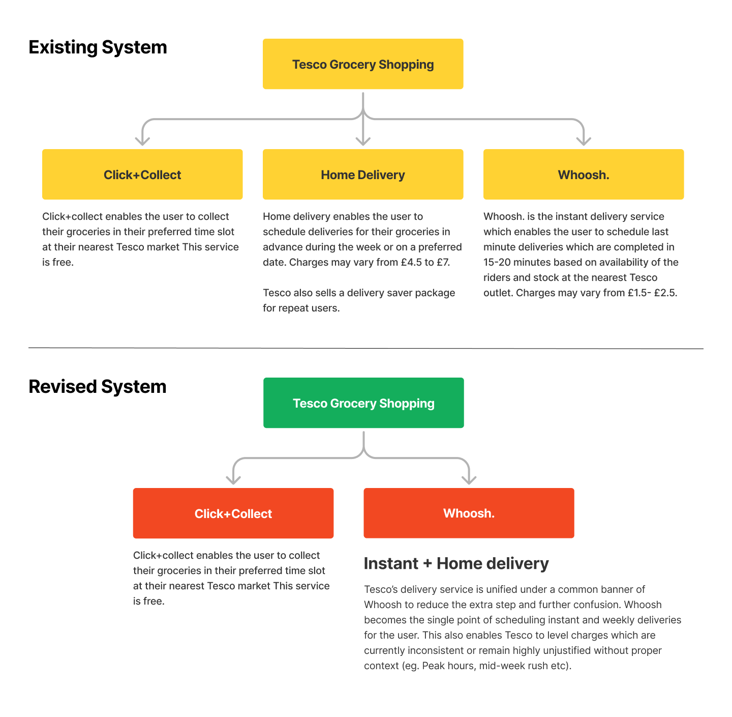
Revised Information architecture
Low fidelity wireframes
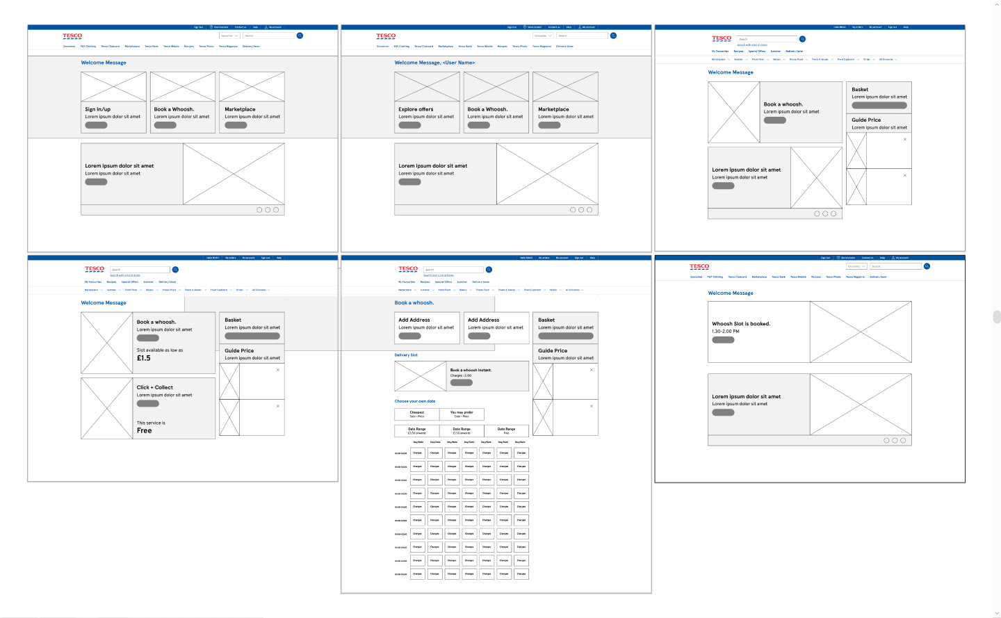
Low Fidelity wireframes from grocery homepage to slot booking confirmation
Final Design
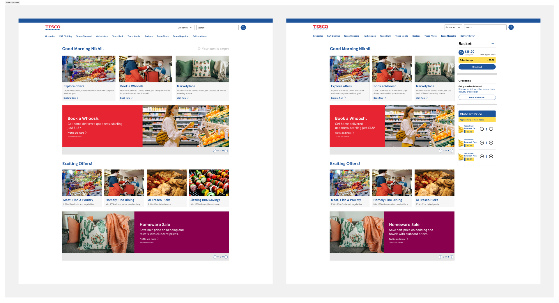
Comparison between the empty cart state and filled cart state of the homepage

Comparison between scheduling a Whoosh or Click+Collect Screens
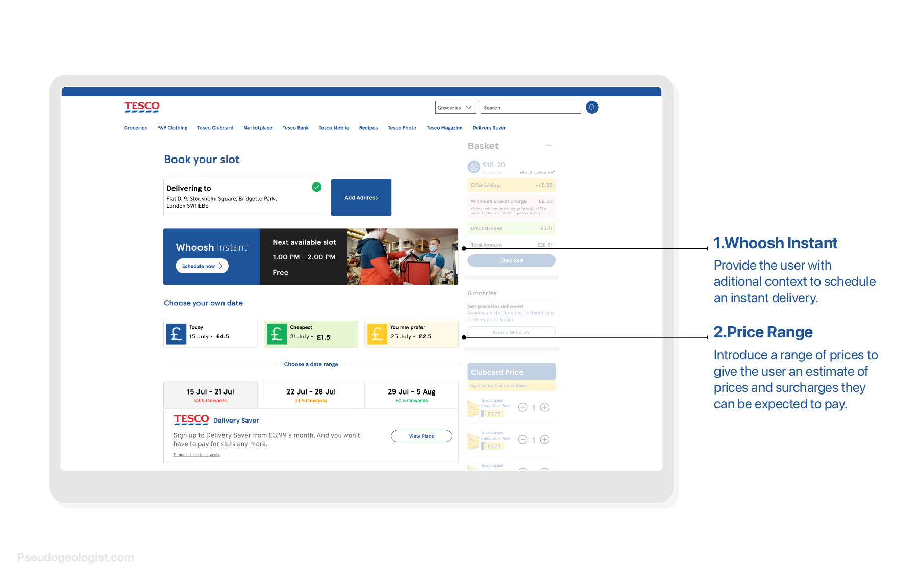
Redesigned Slot booking experience
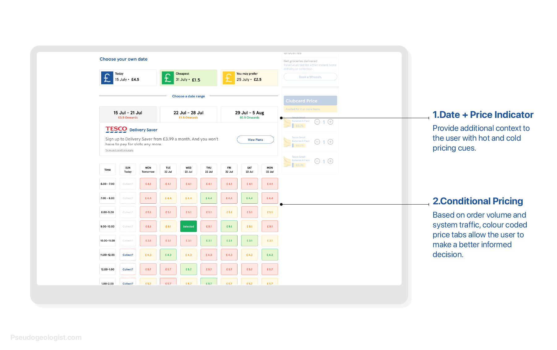
Date and Price Range Indicators
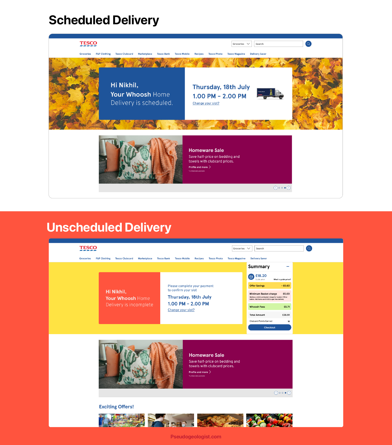
Complete and Incomplete Scheduled deliveries
Why this system works
The revamped screens are more affordable and allow users to make conscious decisions through improved navigation, information grouping, and card design. Apart from resolving the UX problems, I also worked on the UX copies which nudge the user to make faster decisions, eliminate doubt and enhance the selective experience of scheduling deliveries.
The revamped process consumes 40% less time than the previous process, allowing the user to make a more calculated decision in the least time possible.
The revised design system is a significant development from the existing system with more heuristically important
Key Learnings
Tesco's delivery system is already part of a robust and well-designed ecosystem of applications, but I firmly believe that certain interventions can make the system perform even better and create an opportunity for a better user experience to be weaved paired with an aesthetic user interface.
To learn more about this project, get in touch


